One Checkout

An end to end redesign

The challenge

JustGiving has helped 15,000 charities raise over $4bn in the last 14 years. However, the donation process, or check-out, was showing its age and wasn't mobile friendly. Considering that 29,000 people give to charities, causes and individuals every day, there was serious potential to boost revenue through this funnel.

What we knew

Design principles

Considering what we knew, we needed to respond to these issues and not forget the goals that we, as a team agreed upon:

  • Role - Lead UI Designer
  • Client - JustGiving
  • Year - 2015 - 2017

One checkout, JustGiving

A responsive, modular, flexible system that works across all JustGiving products.

Project 01b

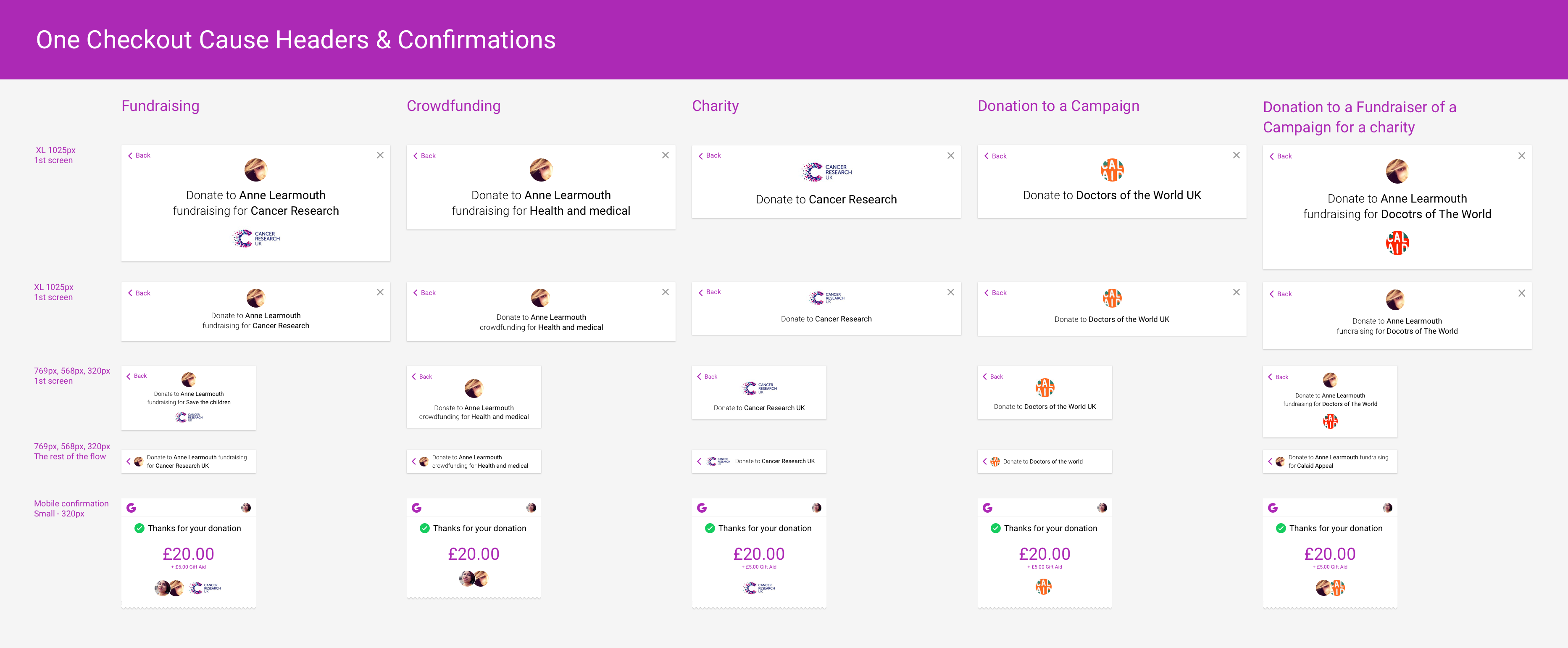
Header modules vary depending on where you are in the flow and which product you're on.

Project 01a

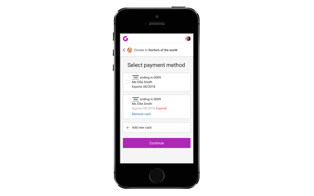
Adding and removing payment cards from the mobile flow. Framer to the rescue!

Project 01a

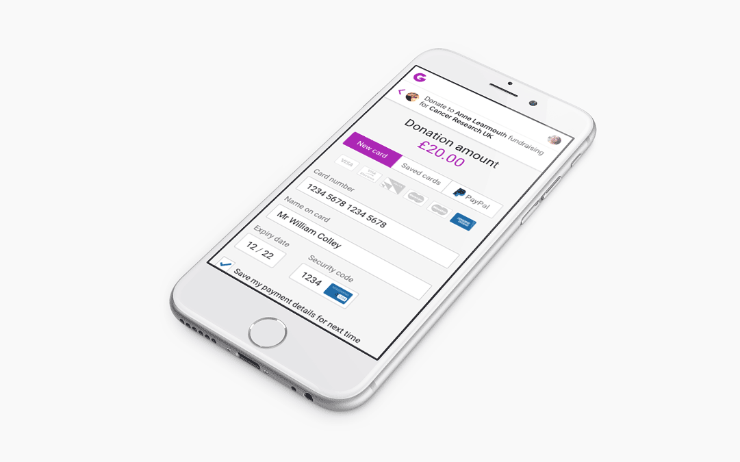
New markets mean more card types.

Project 01a

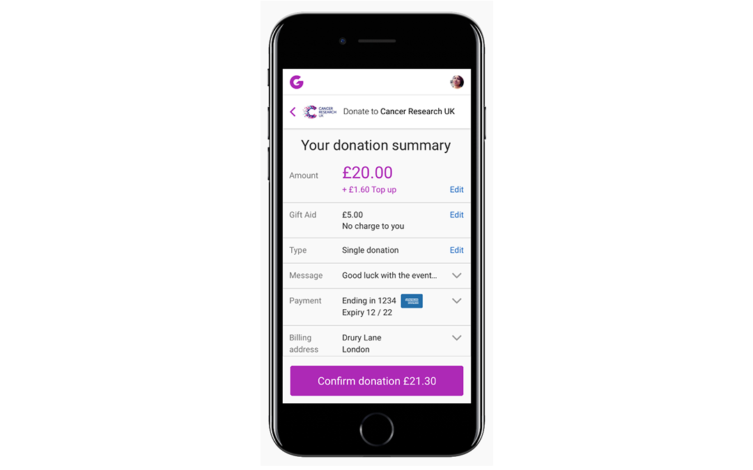
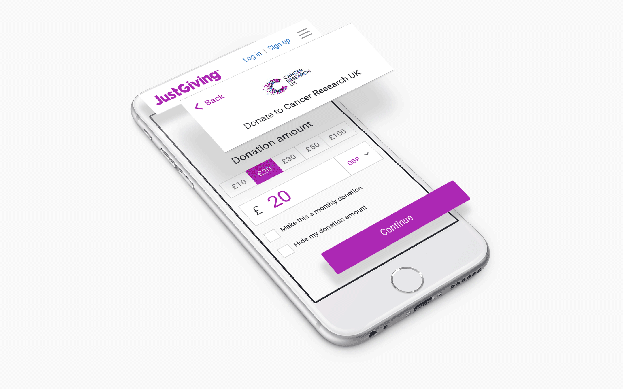
Paying online is important for so many reasons, and giving users the right feedback is essential. Trying to communicate this kind of choreography to our awesome Front-end devs would have cost a small fortune. Enter Framer prototype.